In the corporate environment there’s a common misconception converting a design for desktop-wide screens is as easy as moving the left and right sidebar above and below the main content respectively. To all involved parties’ dismay this is not really the case. You can find many pages on the internet writing about the best responsive design practices (such as mobile-first design), however there’s none, or almost none, about technical gore such as viewport (if one disregards the meta tag) and necessary UX considerations to account for somewhat small smart phone screens.
Disclaimer: I’m not a designer (nor UI, nor UX) so spare me.
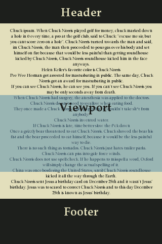
Stationary viewports
I was in process of taking care of front end of yet another web-based application which got its responsive design made from yet another terribly thought out desktop-sized design. Then a really strange bug from quality assurance 1-person-team about viewport jumping around got assigned to me. It read:
After a button is clicked the next page opens, but with the window jumped off to odd location.
The bug puzzled me at first as no form of viewport manipulation was done whatsoever at any point of application. As I navigated to another page realisation hit me the cause was nothing else than the method we use for loading pages.
The application in question happens to use AJAX for loading page content and the issue could easily be reproduced only after navigations from content-rich pages to pages with almost no content at all. Viewports simply do not move around without a reason. Quite the contrary, they stay as close as possible to their original location and as amount of content shrinks, parts that originally were invisible below the viewport come up becoming visible.
Indeed, the “odd” location was almost always the footer of the page becoming visible as the newly “loaded” page contained a tiny amount of content compared to previous page. This animation illustrates the issue quite well.
Controlling the content
The obvious way out in this case is to make sure there is no way to let user get into situation in which user can observe the “viewport jump” – ensure user’s viewport is never close to the bottom of the page when presenting an active region which causes a change of content. Put buttons and links towards the beginning of before the content instead of after it, for example.
For more application like pages such as games or quizzes it could be sensible to simply make sure all views/pages are similar (or equal) in height making height of the page more or less constant too and avoiding the problem altogether.
Controlling the viewport
If the control of content is impossible due to its dynamic nature, controlling the viewports is the other way out. Viewports are a part of observable user experience and hoping for the best just will not do. Neither will scrolling to (0, 0) on every view change, especially on mobile devices, where it is unusual for header to occupy most of the screen.
As much as one would like to have one solution fits all thing, there is no such thing. One must account for various variables such as location of chrome (header, footer), the priority of content, action area locations, current viewport size and so on. Scrolling to the beginning of content area when another page is loaded should generally be a good choice, though.
And do not ever move the viewport somewhere without explicit user action.
To summarize, the browser viewport is a part of observable user experience. Doing nothing with it (especially in dynamic applications) will burn you and make the application look somewhat unwelcoming.